How I created a design for a fictitious coffee company based in Brighton.
Timeframe: January 2023 - March 2023
Introduction & Brief
I designed and created Toucan Coffee, a website for a fictional coffee company based in Brighton. I chose to start with a coffee website as my first project because I love coffee and enjoy trying new and independent coffee brands. I feel that these types of businesses offer the best and most unique coffee compared to the standard, boring coffee brands.
My ideal vision for the coffee shop was to create a relaxed and cosy environment for customers, surrounded by plants and with an indie vibe. Therefore, I wanted the website design and layout to reflect this atmosphere.
To begin, I started by researching various coffee brand websites to see how they designed their websites and how visually appealing and user-friendly they were. I took note of their colour schemes and layouts, as I believe that having eye-catching colours and font styles is crucial in attracting customers and keeping them engaged on the website, ultimately leading to purchases. I also made sure to check how these websites appeared on mobile devices, as it was important to me that my website could be easily accessed on mobiles as well.
After conducting research, I proceeded to create a design brief that covered all aspects of the website's design process. I wanted to fully immerse myself in the coffee brand and understand its ethos in order to determine the most suitable design and layout for the website. The design brief included the following elements:
Coffee shop location
Product offerings
Team members/creators
Ethos of the coffee shop
Colour scheme
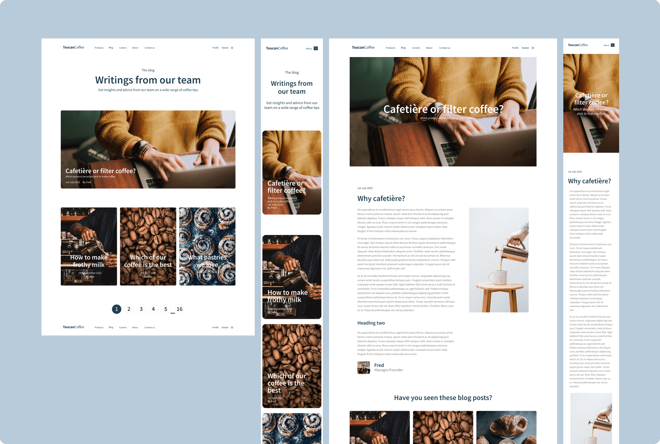
Blog section
Contact page
Home page
Checkout/basket page
Careers page
Header/footer with navigation
Mobile compatibility
Wireframes + Design
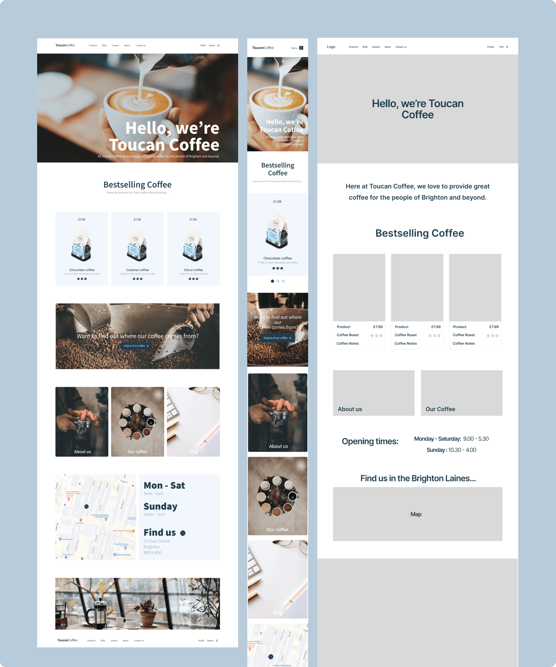
Once I had a comprehensive design brief, I began creating wireframes for the website. These wireframes allowed me to visualize the layout, colour schemes, and text styles, ensuring an appealing and user-friendly experience for customers. I also created wireframes specifically for mobile devices to ensure optimal versatility.
For font selection, I opted for Inter as it is a simple yet effective font for providing information to customers and is easy to use on websites and mobiles. The colour palette I chose consisted of blue tones, similar to the colours used in this portfolio. I felt that the contrasting moody dark blue and pale blue colours against a white background would be appealing to customers and create a suitable atmosphere for a laid-back coffee website. Additionally, the colour scheme would align with the coffee company's fictitious branding.
I created wireframes for every page of the website to get a clear visual representation of how the website would look and assess its usability and accessibility for customers.
Moving on, I focused on designing the home page, which I believed would be the most crucial part of the website for attracting and engaging customers, encouraging them to explore the products and make purchases. I envisioned a large photo of the coffee brand on the home page, accompanied by a captivating title. I also included snippets of the coffee company's product offerings and links to other sections of the website. To provide customers with information about the coffee shop's location, I incorporated a map and displayed the opening hours. Including ample imagery in the website design was important to catch the customer's attention and highlight the coffee brand's offerings. I was pleased with the outcome of the wireframe, as it helped me fine-tune the design, text sizes, and other elements, resulting in a successful completed home page design.
The next stage involved designing the website itself. This stage took less time compared to creating wireframes, as I already had a solid foundation to work with. I focused on filling the website pages with content, imagery, and the established colour scheme to create a cohesive and visually appealing final product. Once the imagery and colour scheme were in place, I identified areas where I needed to adjust font sizes and layout elements to ensure a user-friendly and accessible experience for customers. It was crucial for the website to feel easy and enjoyable to use, as this would encourage customers to make purchases.
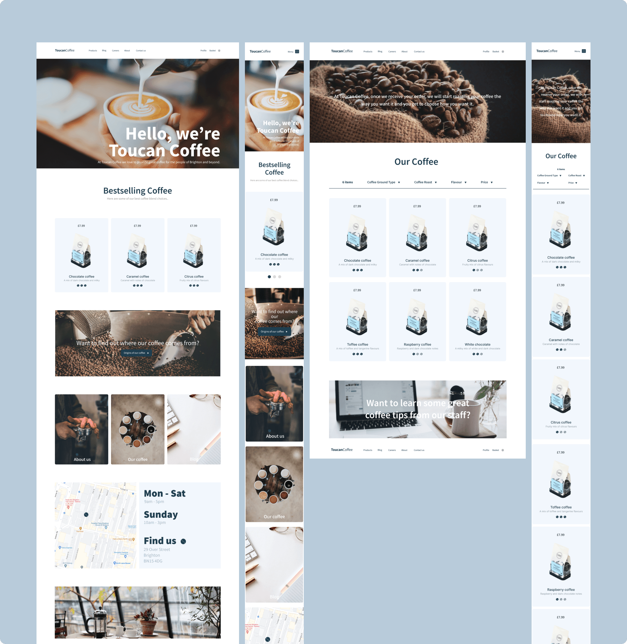
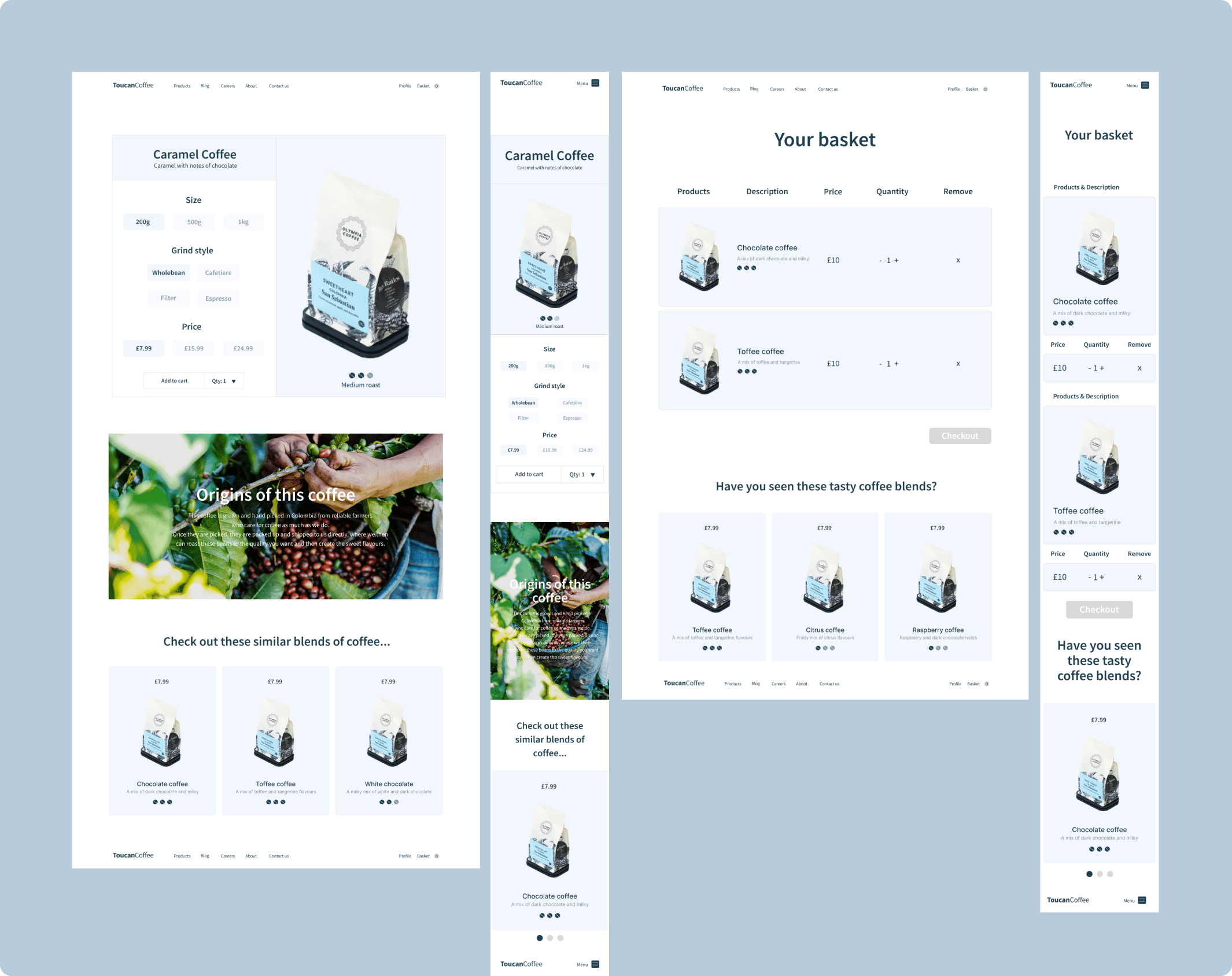
The examples provided showcase different pages of the website and provide additional information about their design.
For example, the product listing page allows customers to use a filter at the top to select the type of coffee, roast, flavour, and price range they prefer. Clicking on a specific product takes them to the dedicated product page, where they can find more information about its origins, size, grind style, and price. This detailed information helps customers make informed choices and personalize their coffee selection. Once customers have made their selection, the chosen products are added to the basket page.
The basket page was designed with simplicity and ease of use in mind. It features a summary of the selected products, options to add more items or remove them, and suggests other coffee products to entice customers to make additional purchases.
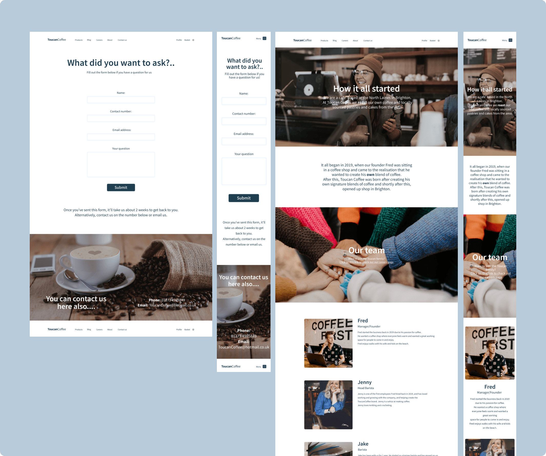
Below you'll find designs for the other pages on the website. This includes the checkout page, careers page, contact, and about us. All of these are vital aspects of the Toucan coffee website.
Conclusion
In conclusion, the Toucan Coffee website project was a creative endeavor focused on capturing the essence of an independent coffee company through a visually appealing and user-friendly website. Thorough research on existing coffee brand websites provided valuable insights into effective design elements and user experience. By incorporating these findings into the design brief, wireframes, and final website, key features such as location information, product listings, team details, and a captivating home page were seamlessly integrated.
The project's emphasis on creating a relaxed and cosy atmosphere was reflected in the carefully chosen font, Inter, and the soothing blue-toned colour palette. Attention was also given to mobile compatibility and the inclusion of compelling imagery to enhance the overall user experience. The ultimate goal was to provide an enjoyable browsing experience that would drive sales and customer engagement, keeping the brand's ethos at the forefront.
The Toucan Coffee website project exemplifies my passion for design and my ability to translate a brand's identity into a captivating online platform. Through meticulous attention to detail, this project showcases my skills in creating user-centered experiences and crafting cohesive digital representations for fictional coffee brands.
Made with ☕️ & ❤️
